
Most B2B SaaS homepages read like they were written by committee. Everyone got a line in. Nobody said no to anything.
The result: a homepage that loosely describes features, an unclear position within an existing category, and a visitor who leaves in the first five seconds without ever learning if you're for them. In an age where you need to be a purple cow, companies are showing up like a beige one.
See below good vs. bad execution of a UVP on the homepage and most importantly, what’s the fix.
The Feature Dump vs. The Single Promise
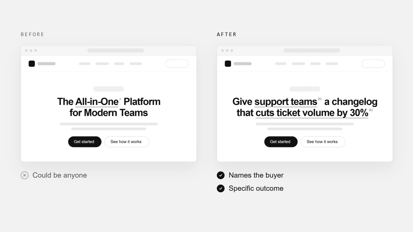
"The All-in-One Platform for Modern Teams" could sit on a hundred competitors' homepages and nobody would notice it moved. It's not wrong, it's just generic enough to describe almost any tool built in the last decade. That's usually a sign the team hasn't decided what the product is actually for. Why you’re for and why. A sure fire way to get lost in a sea of sameness.
"Give support teams a changelog that cuts ticket volume by 30%. " does the opposite. It names one job, one outcome, one buyer, and gets out of the way. You read it instantly and will know if this is for me or not. That's the entire job of a homepage headline.
The rule: If your headline could sit on a competitor's homepage without anyone noticing, it's not a UVP, it's a category description.
The Vague Benefit vs. The Specific Outcome
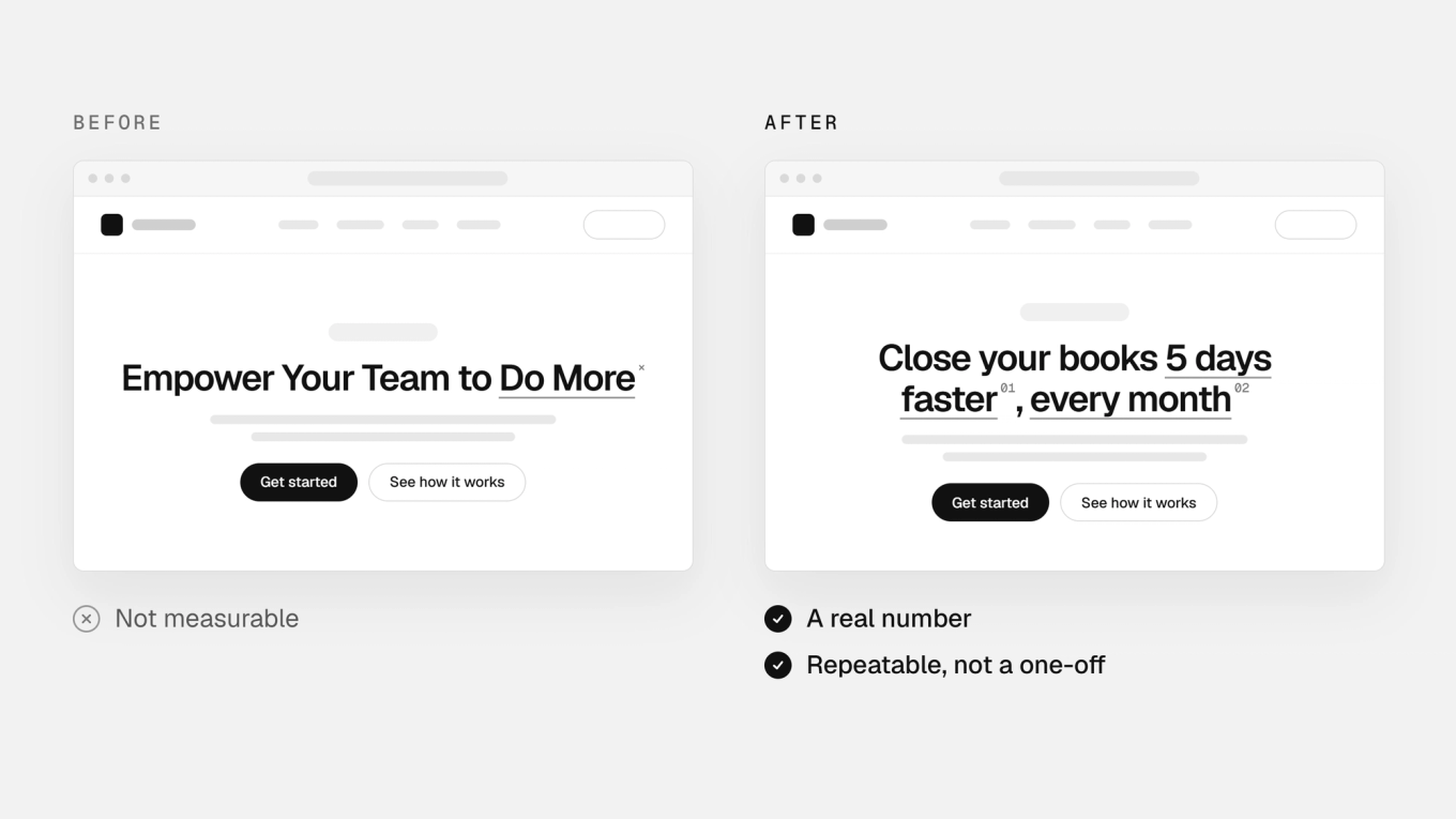
"Empower your team to do more" is more based on vibes, rather than a measurable outcome. Nobody can picture it, measure it, or repeat it to their boss to justify a purchase. It sounds like progress while promising nothing you could ever be held to.
"Close your books 5 days faster, every month" is a number a CFO can screenshot and paste into a budget request. Specificity is the entire mechanism that makes the claim believable in the first place. Vagueness places you in the sea of sameness. Get specific to stand out.
The rule: If a visitor can't repeat your headline back to their boss as a reason to buy, it's too vague to convert.
Generic Social Proof vs. Specific, Relevant Proof
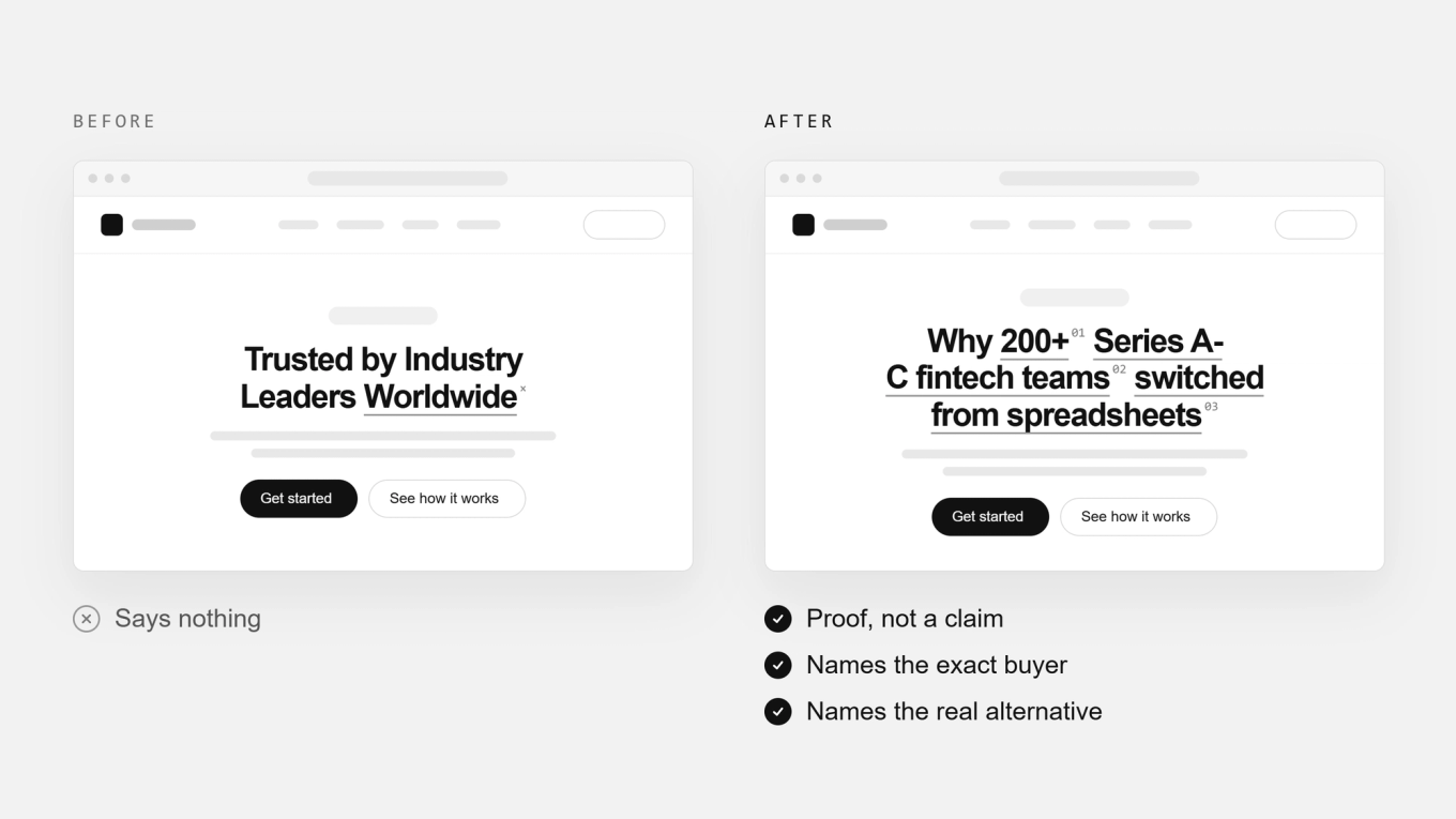
A wall of recognizable logos answers one question: "who uses this?" It never answers the question your actual visitor is silently asking, which is "should someone like me use this?" Without context, a logo is just decoration. Social proof should highlight who you’re for.
"Why 200+ Series A-C fintech teams switched from spreadsheets" filters instead of impresses. It names the exact segment, states the specific alternative being replaced, and backs it with one believable number instead of five decorative logos. One relevant proof point will always outperform ten generic ones.
The rule: Social proof isn't about being trusted by everyone. It's about being trusted by someone who looks exactly like your visitor.
The pattern behind all three
Every weak headline above tries to appeal to everyone, which is exactly why it resonates with no one. Every strong one is willing to be wrong for someone, in exchange for being unmistakably right for someone else.
This is why a strong unique value proposition acts as the keystone for your homepage headline. Creating a strong homepage headline follows from knowing exactly who you’re for and why.
Want a second opinion on yours? Book your sprint today.

 Matt Wilson
  Maxx Bethke

